Piri Piri: A Fiery Celebration of Mozambique
Piri Piri is more than a hot sauce—it’s a tribute to the bold flavors and vibrant culture of Mozambique.
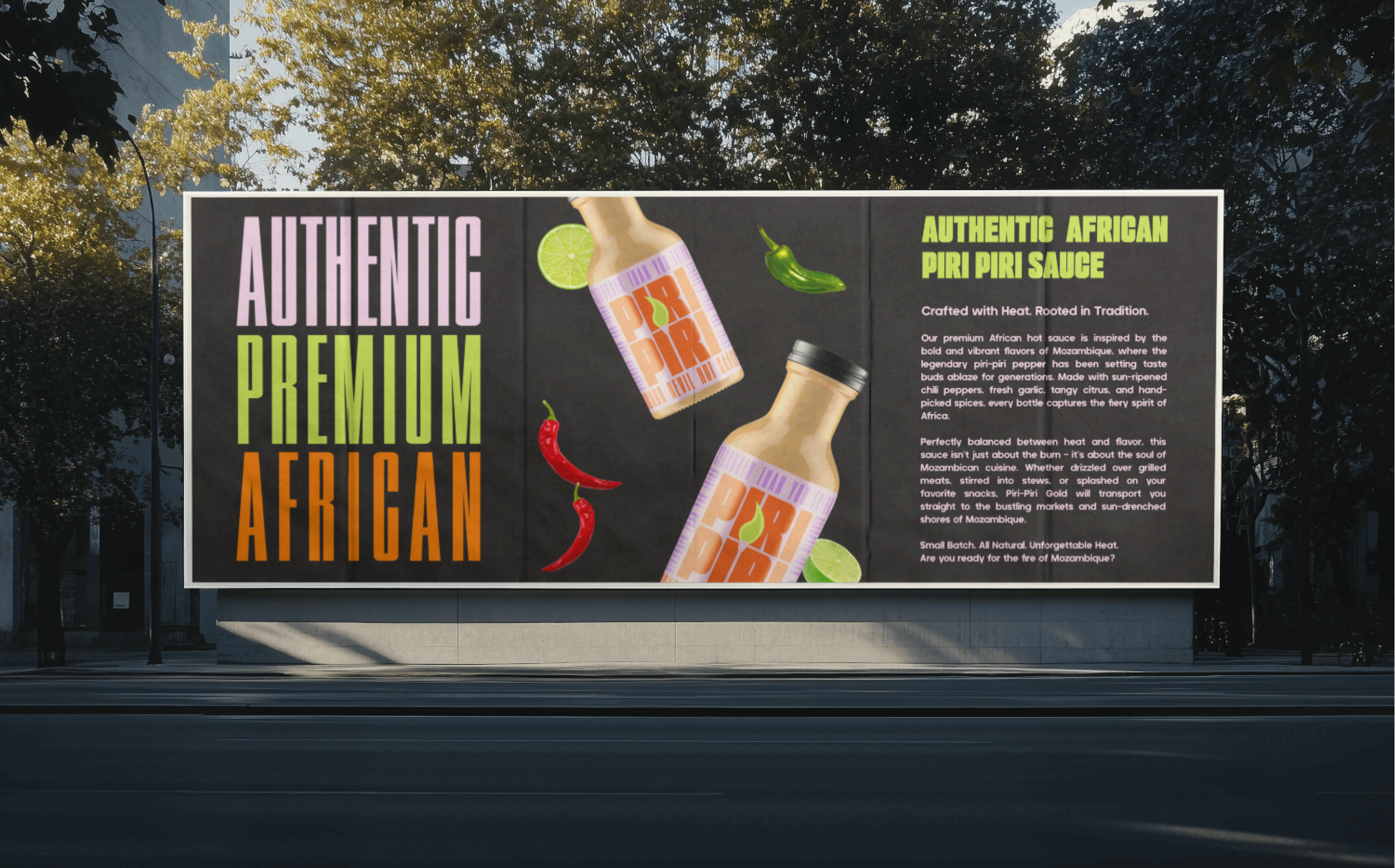
Southernmost Creative was tasked with crafting a brand identity as spirited as the sauce itself, blending tradition with modern appeal. From the sun-drenched shores of Maputo to the bustling markets of Beira, every element of Piri Piri’s design honors the roots of this iconic African condiment, inviting food lovers to experience heat with soul.

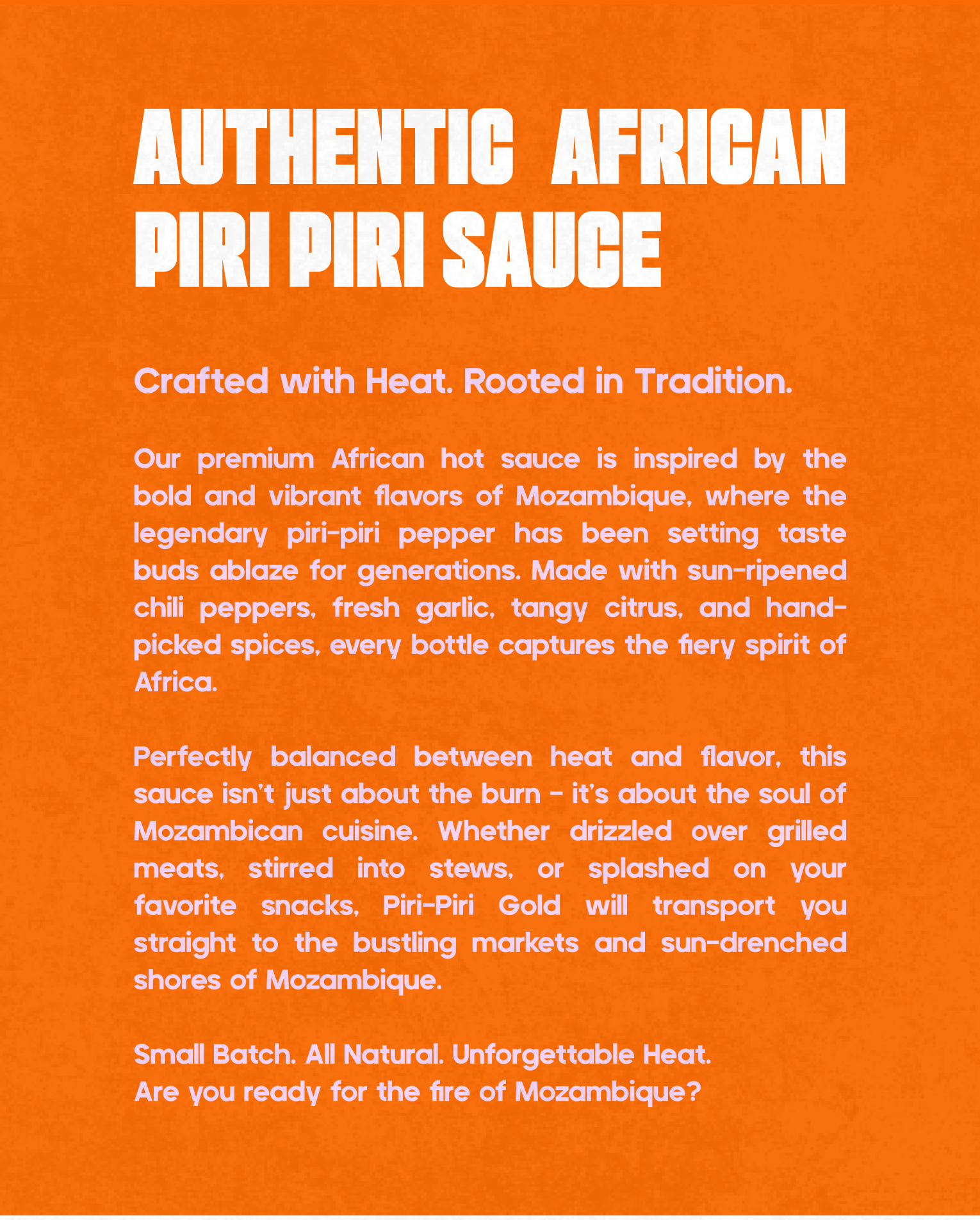
Inspired by Mozambique’s rich culinary legacy, the brand’s identity is a fusion of warmth and authenticity. The color palette mirrors the hues of African sunsets—earthy reds, golden yellows, and deep blacks—while the logo suite reflects the sauce’s artisanal craft. Each flavour is named after a Mozambican city, like “Maputo Fire” or “Beira Blaze,” weaving local pride into every bottle. The packaging design balances rustic charm with premium elegance, featuring hand-drawn chilli illustrations and bold typography that pops on shelves.
Beyond aesthetics, Piri Piri’s storytelling celebrates the people behind the peppers—small-batch producers who harvest sun-ripened chilies and hand-picked spices. The copywriting crackles with energy, urging consumers to “Bring the Heat. Taste the Culture.” From Scoville ratings to ingredient transparency, every detail reinforces authenticity.